ogp
Overview
  • On Wednesday, April 2, 2025, I refreshed this website’s design for the first time in about three years!
  • I’ll record the reasons, concepts, and thoughts behind the changes—along with the old look.
  • I worked really hard on this, so it might be self-indulgent… but I’m going to talk a lot! 😂 It’s long, so please read only if you’re interested.

A Slideshow on the Top Page

Screenshot of the previous MiniaTuria website top page

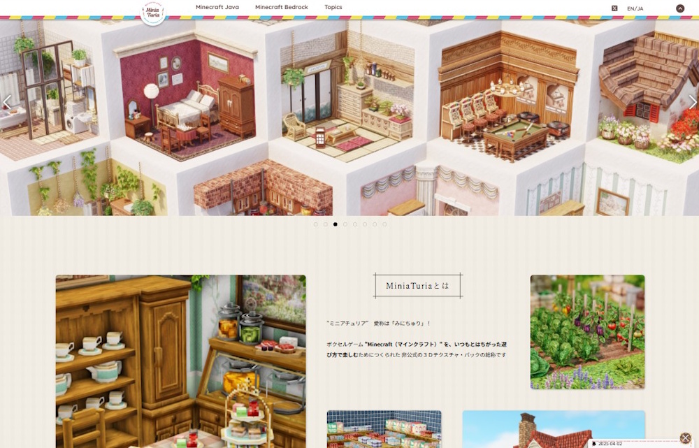
Before~~~~!!! The MiniaTuria logo spun around, and the menu moved upward as an “opening” effect. When I first started making the site, I was at that stage of “I want to animate something!” lol The layout was also breaking on mobile, so I thought: “Okay, it’s time to rebuild the top page into something more practical…”

Screenshot of the new MiniaTuria website top page

After~~~~!!! I kept only the logo and the pink–yellow–blue “MiniaTurian tricolor,” then fully renovated the rest while preserving the brand feel.

Added a slideshow to the top pageEach slide is a link, so you can jump directly to the release page that matches the image → The slides change automatically, but if you hover your mouse over it, the slideshow pauses (PC only)

・Also, the thing I struggled with the most was how to announce “What’s New”… → In the end, I decided to show a pop-up in the bottom-right corner that guides you to new content From a user’s perspective this can get pretty annoying, so I’ll use it sparingly 😂

Separated Content into “Java” and “Bedrock”

Separated content into “Java” and “Bedrock”

I limited the main menu categories to just three: “Minecraft Java” “Minecraft Bedrock” and “Topics”. This is the biggest intention behind the redesign!

I wanted to add “Bedrock” as a major MiniaTuria content pillar and place it side-by-side with “Java.” That was the main goal! It also matches the overall direction of the MiniaTuria development project. I wanted users to be able to choose one right away the moment they arrive. So I removed other menu items to focus attention on these two.

I also made the top page feel like a question: “Which one do you like?” “Which one will you choose?” (On mobile, Bedrock comes first—because many phone users are more likely to be interested in Bedrock!) After choosing, you can see “What’s New” within each side, and I tried to show lineups with images so things stick in your memory visually.

By the way, this is what the menu looked like before the redesign.

“Topics” as an Information Bulletin Board

“Topics” as an information bulletin board

So… what is this third menu item, “Topics”?

It’s a bulletin board where you can check everything besides releases! This website isn’t just a place to download packs— I also want it to serve the role of sharing all the related information you might need when playing with MiniaTuria.

・Event information ・Blog-style announcements (like this article) ・Helpful guides (install/setup, tools, recommended external sites, etc.) ・Terms of use and FAQs ・Making it easier for people to support the project, and more

Older posts that don’t fit here will be stored in an “Archive”… Oh! And another highlight of the redesign is that I turned all pages into a database and made them listable in archive pages. I built it like a blog category system.

A Gallery Area for #MiniaTuriaChallenge Submissions

A gallery area for #MiniaTuriaChallenge submissions

A key mission of the redesign!

Mission 1: “Split Java and Bedrock, and make them the two top pillars” Mission 2: “Turn all pages into a database and make access & publishing more convenient” And the third one was: “Bring the MiniaTuria Challenge event fully into this website.”

“Bring it into the website”… I’m not sure how to phrase it, but… Until now, MiniaTuria Challenge submissions were compiled on an external service. I stopped doing that, and instead made it so you can browse the submitted works collected right here on this site.

External services definitely have advantages! For example, submissions get shared outside the community and are more likely to be seen. But I felt limited because I couldn’t control how the works were displayed.

In-site gallery area

With an in-site gallery area…

I can design the display so older works are easier to discoverI can keep a record of special rules for unusual “Special Edition” events …in other words, I can respond flexibly.

Originally, “Mini-Challe” is an event on (old) Twitter / X, so that’s where everyone is, and that’s where most viewing happens. So this website has mostly been a record-keeping place… but I wanted to connect both sides and keep the “event feeling” alive.

So I made the top image of the gallery page also work as an announcement image for the building theme & event period that can be used on social media. I wanted what you see on X and what you see on this site to match. Next, I’d love to increase visits to the event pages so participants also gain more views as a benefit!

Closing

And yeah—when I start talking, it gets long 💦 There’s still more!! (lol) Like the block catalog system, for example. But more importantly, some key pages from the old site haven’t been renewed yet (oops). I want to update the main content pages as soon as possible… Anyway, thank you as always for supporting the MiniaTuria project!

× large image