OGP image
Article Overview
  • On Saturday, December 27, 2025 — just in time before the year ends! This is the second site redesign of the year.
  • I’ll be talking (a bit indulgently!) about the details and improvements since the last version.
  • I think it’s much easier to use now, so if you’re interested, take a look 👀

Improved Functionality!

New Chocomint version of the MiniaTuria website

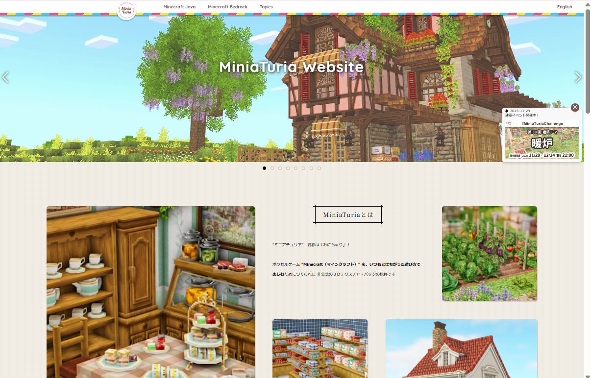
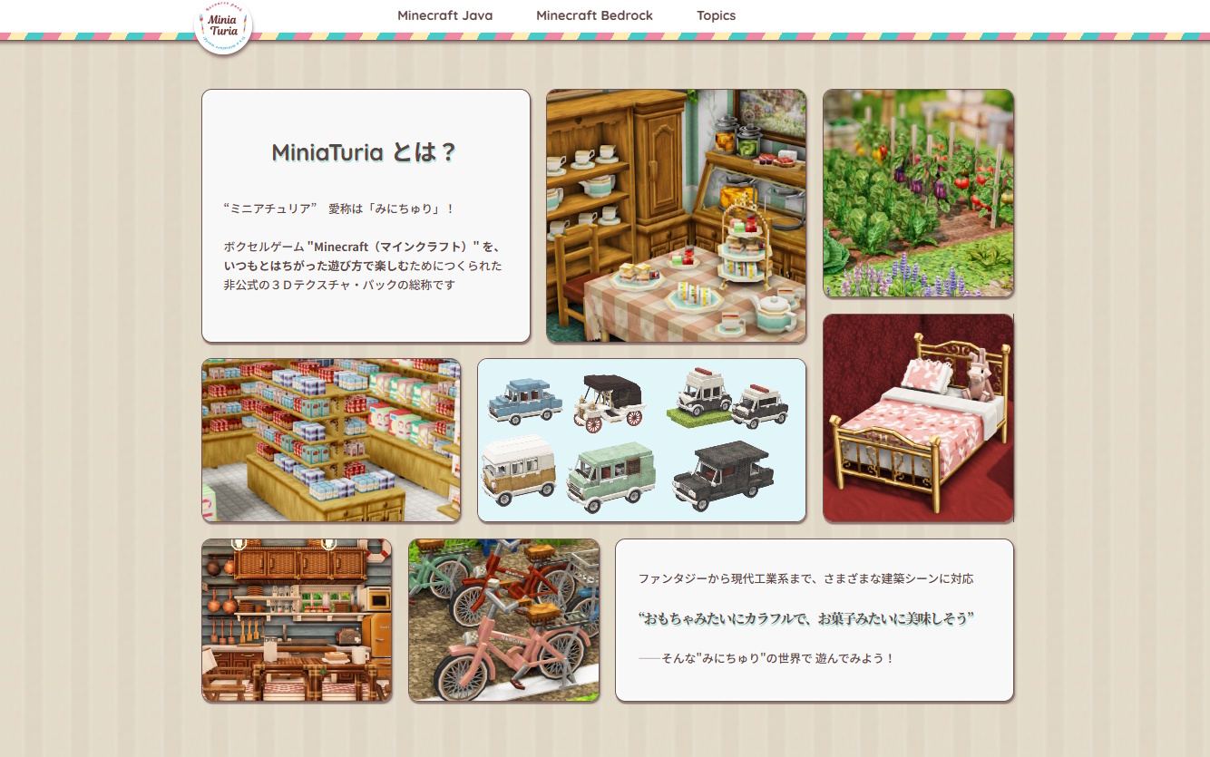
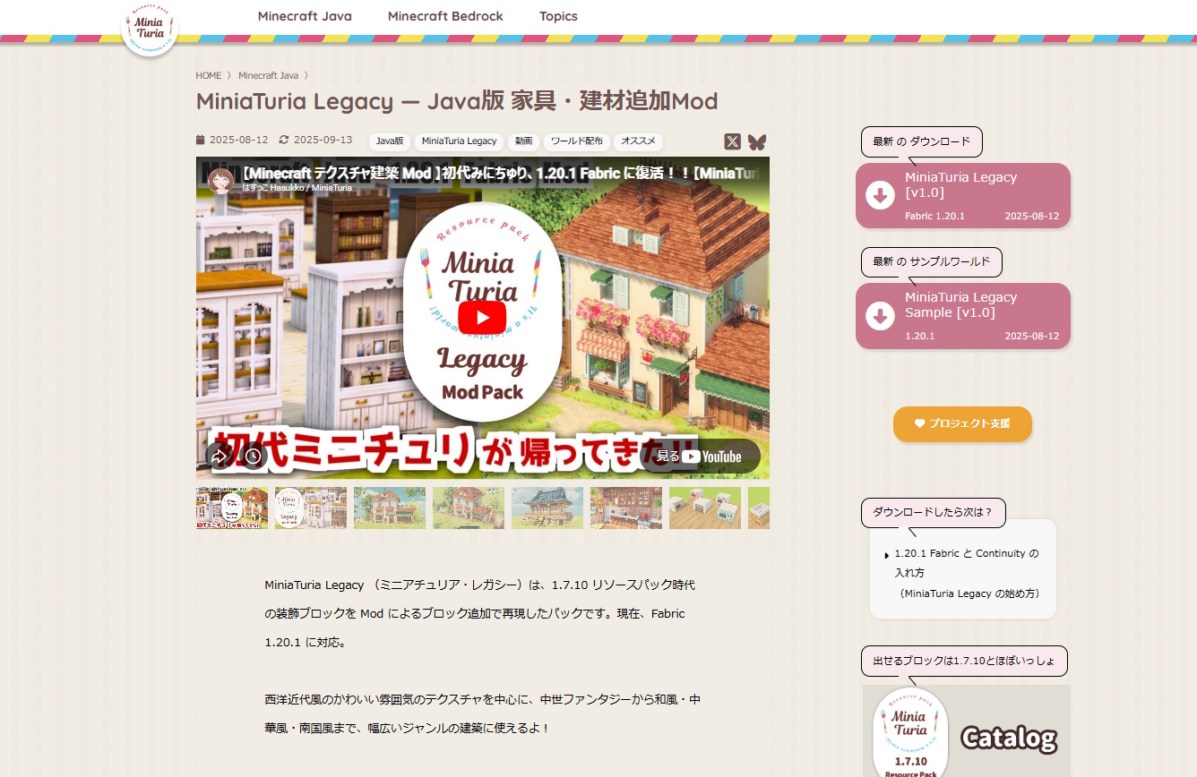
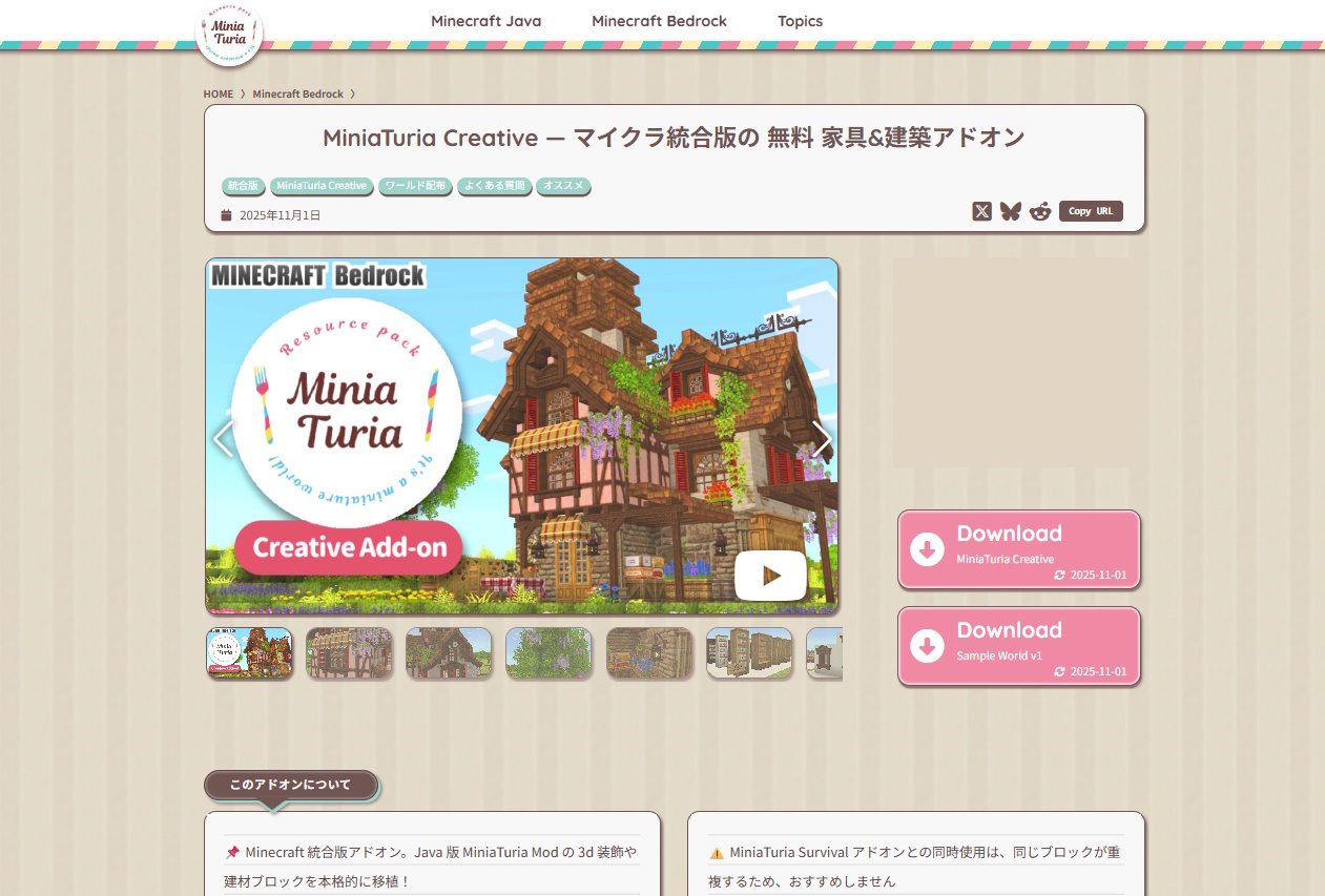
Right before the end of 2025, another unexpected site redesign?! This time, instead of a full redesign, I focused on improving functionality while keeping the previous design. I call it the “Chocomint Version”!!! I’ll walk you through the changes while keeping a record of the previous design as well!

Overall features include a chocomint-inspired color palette and bold outlines around every page element to enhance presence. Since articles were already managed as cards, I wanted to fully leverage that strength!

All cards were given glossy highlights and shadows, aiming for a puffy, sticker-like texture with a chocolatey sense of depth. A round, bouncy feel… maybe even a bit like a game UI.

Text sections are also card-based and broken into SNS-like readable chunks. I even added notebook-style ruled lines for extra cuteness.

Previous slideshow design

The slideshow was redesigned to be more compact and lineup-focused. ↑ It used to be this big!

The “New Information” popup was removed because it got in the way. Instead, I added a clearly visible updates section right below the slideshow. Since it’s card-based, it’s easy to understand at a glance. Clicking “See more >” takes you to the archive — another benefit of card-style management!

MiniaTuria introduction with stone-paving-like layout

Below that is the MiniaTuria introduction — I really put effort into this part! Keeping the puffy card style consistent, while arranging them like stone pavement for instant visual clarity.

Download Page Improvements

New download page

I think each download page is now much easier to read thanks to the card layout! ↑ The previous design tried to guide users with speech bubbles on the right, but it ended up feeling a bit cluttered due to too much information…

Previous download page design

In the new design, speech bubbles are no longer emphasized. By separating information into cards, the layout feels much cleaner! Added “Reddit” and “Copy URL” buttons to the SNS section!

Reddit is popular in Western gaming communities, and since MiniaTuria gets the most traffic from the U.S., I thought it’d be a good fit. The Copy URL button makes sharing easier on mobile, especially for video-based platforms like Instagram and TikTok. Both are improvements aimed at social sharing!

Distribution info shown clearly with cards and badges

Release descriptions now heavily use card designs!!! Key points and warnings are kept short and easy to understand.

Distribution details are displayed as cards and badges for clarity. Since each card itself is clickable, you can easily jump to installation guides and related pages.

The separate FAQ page was removed and integrated directly into each download page! General questions can now be found via the Topics → Contact menu.

Easier to Follow the Process

Article cards displayed side-by-side on PC screens

Breaking content down into cards really shines here. On PC screens, cards are arranged horizontally instead of just vertically, allowing more information to fit on a single screen. This is especially helpful for step-by-step guides like addon installation. Images can be clicked to enlarge!

On reading and guide pages, the table of contents stays fixed on the right on PC, making it easier to track your progress.

Dropdown Menu

Dropdown menu with submenus

The main header menu items remain the same, but submenus were added to better organize content. With more space available, pages can now be displayed as cards here as well!

Previous crowded menu area

This was the previous menu area. Easy to scan, but it was getting pretty cramped 💦

Adding submenus increased the number of steps, so I wanted to keep access as smooth as possible… That’s why I chose hover-based menus instead of click-based ones. The submenu is arranged vertically on the left, preventing accidental mouseouts before clicking the desired card.

A Slightly More Luxurious Footer

Footer design with increased SNS buttons

At the bottom of the page — chocolate-colored, cute, and delicious-looking… More SNS buttons! This includes not only MiniaTuria accounts, but also my personal ones 😄 Short-form videos have really become the main way people share Minecraft info lately.

Previous blackboard-style footer

I’ll keep the previous footer design here as a memory. Blackboard-style! It used images and was quite heavy, so this time I switched to a lighter approach. Since articles are managed as cards, you can still search by tags — that part hasn’t changed.

In Closing

This ended up being another very self-indulgent redesign report 😂 Thank you so much for supporting MiniaTuria this year! I was worried it might not be ready before the year ended, but I made it in time 😆 I plan to continue releasing lots of content with this new design next year, so please keep supporting the MiniaTuria project!

× Large image